Graphs of quantitative data
Graphs of quantitative data, also called grouped data, can be displayed using a histogram or a polygon.
How to graph quantitative data
- Put the classes on the horizontal axis
- You can either put the frequency distribution, the relative frequency, or the percentage on the vertical axis.
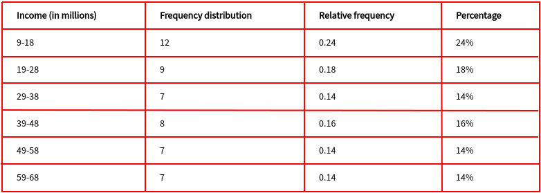
In the lesson about construction of a frequency distribution, we ended with this table showing the frequency distribution, the relative frequency, and the percentage distribution.

Let us make use of a histogram and a polygon to display the data. There is little difference between the two graphs except that the histogram uses rectangles, but the polygon uses dots.
In both cases, we will use the frequency distribution to make the graphs.
Histogram
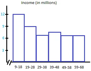
First, put the classes on the horizontal axis. Second, put the frequencies on the vertical axis.
Finally, draw a rectangle for each class so that the height of the rectangle is the same as the frequency of that class.

Notice that all the rectangles are adjacent and they have no gaps between them unlike a bar graph.
Notice that the numbers from 0 to 8 are not shown on the horizontal axis.
Notice also that right before the first rectangle on the left, there are 2 small parallel lines making the horizontal axis discontinuous.
We call this a break or a truncation in the axis. Whenever some numbers are not shown on the horizontal or x-axis, we will truncate the x-axis.
This histogram above is called a frequency histogram.
If you had used the relative frequency to make the histogram, you would call the graph a relative frequency histogram.
If you had used the percentage to make the histogram, you would call he graph a percentage histogram.
Polygon
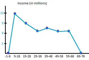
To draw a polygon, just use dots instead of rectangles.
Place a dot right above the midpoint of each class.
The height of the dot should equal to the frequency of that class.
Create 2 more classes. The first one is created before 9-18 and the second is created after 59-68. Both of these classes will have a frequency of 0.
Connect all the dots with straight lines.

Notice that this time, we did not truncate the x-axis since all the values on the x-axis are used.
The graph above is called a frequency polygon or simply a polygon.
If you had used the relative frequency to make the polygon, you would call the graph a relative frequency polygon.
If you had used the percentage to make the histogram, you would call he graph a percentage polygon.