Circle graphs
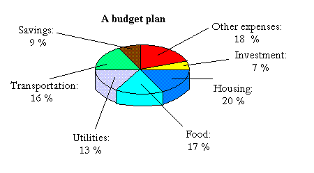
Circle graphs, also called pie charts are used to show how the whole of something is divided into parts. The following is a circle graph:


The figure is broken down into 7 parts or chunks. You can also called each part a sector.
Each sector is a representation of the amount of money you spend on a or some specific need(s.)The sector in yellow means that 7 % of your income goes to investment.
On the other hand, the whole circle represents your net income or the amount of money you bring home after taxes have been taken.
The whole circle means 100% of your net income and half the circle means 50 % of your income.
For instance, looking at the circle above, you can see that half or
50 % (20 % + 17 % + 13 %) of your income goes to housing, food, and utilities.
If your net income is 3,000 dollars every month, you will spend 50 % or half of 3,000 (1500 dollars) on housing, food, and utilities.
Now, I will show how to construct a pie chart. Before I do so, make sure you review my lessons about percents.
Steps to follow when constructing circle graphs
To construct a pie chart, do the following step by step.
1.
Draw a circle and mark the center with a dot.
2.
Find out how many degrees are in each sector. A circle has 360 degrees. Thus, if a sector is 25 %, just multiply 25 % by 360 degrees.
3.
Draw a radius and use a protractor to measure and draw each sector
4.
Label each sector,show the appropriate percent, and give the graph a title
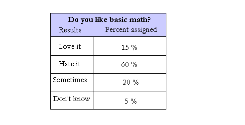
Exercise: After a survey was given to 2,000,asking them if they love basic math, the following result came up.
The result is shown in the table below.Use the table to make a pie graph.

60 % of 360 is 0.60 × 360 degrees = 216 degrees
20 % of 360 is 0.20 × 360 degrees = 72 degrees
5 % of 360 is 0.05 × 360 degrees = 18 degrees
I just did step 2, which is to find the angle that corresponds to the percents. If you follow all the steps described above, you should end up with a good pie chart: