Making line graphs
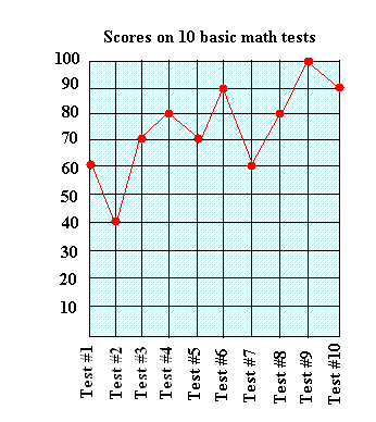
Making line graphs to show change over a period of time is most of the time a straightforward process. Instead of drawing bars, a dot is used at the correct height. Then, we connect all dots on the graph with a line.Take a look at the following line graph. Keep reading while we explain some of its important features such as the title and the scale.
Important features of the line graph above about scores on 10 basic math tests.
The title is " Scores on 10 basic math tests "
The scale is located on the left side of the graph. The distance between each square is 10, so the scale is 10.
It shows scores for a student over a period of time or after taking 10 basic math tests.

Getting information from the line graph
A wealth of information can be deducted from the graph such as the ones mentioned below:
- The lowest score is 40 and the highest score is 100.
- The greatest increase or improvement happened between test #2 and test #3. As you can see the student went from a score of 40 to a score of 70. The line graph made this information easier to identify since the line is longer than most other lines.
- The greatest decrease happened between test #6 and test #7. The student went from a score of 90 to a score of 60. Again, the line graph made this information easier to identify since the line is longer than most other lines.
- Looking at the graph, it looks like although the score dropped a couple of times, overtime the student made consistent progress. This is shown by the fact that the graph has a tendency to up as opposed to going down.
Making line graphs: another example showing how to create one
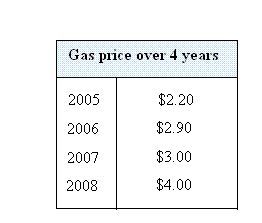
This example is about gas price over 4 years: Use the following data to make a line graph.

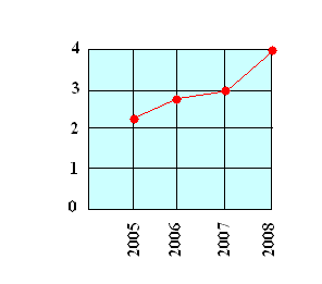
Here is the line graph showing gas price over four years.

Looking at the graph, you can see that the line is steeper between 2007 and 2008. This means that the highest increase was experienced between 2007 and 2008. In fact, the gas price increased by 1 dollar and this is much higher than the other increases.