Scatter plots
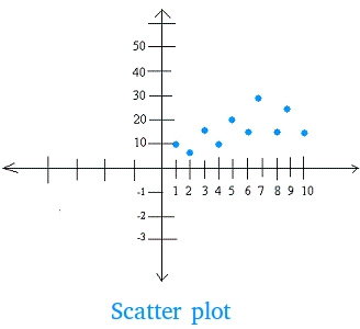
Scatter plots, also called scatter graphs, are used to show relationship between two sets of data by writing them as ordered pairs and plotting these ordered pairs on the coordinate system.
Day 1, you sell 10 notebooks
Day 2, you sell 5 notebooks
Day 3, you sell 15 notebooks
Day 4, you sell 10 notebooks
Day 5 , you sell 20 notebooks
Day 6, you sell 15 notebooks
Day 7, you sell 30 notebooks
Day 8, you sell 15 notebooks
Day 9, you sell 25 notebooks
Day 10, you sell 15 notebooks
You can display this situation with ordered pairs as shown below:
(1,10), (2,5), (3,15), (4,10), (5,20), (6,15), (7,30), (8,15), (9, 25), and (10, 15)
Then we can put the ordered pairs on the coordinate system. The resulting graph is called a scatter plot or scatter graph.
Notice how the points are scattered around and everything is located in the first quadrant.
Scatter plots and the three types of correlation
Two sets of data can form 3 types of correlation.
What is a positive correlation?
When y increases as x increases, the two sets of data have a positive correlation.
Example
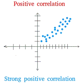
Not only the points have a tendency to go up, they are also very close to one another. In other words, they are not scattered far apart from one another. This type of correlation, as seen in the graph above, is called strong positive correlation as well.
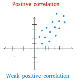
On the other hand, when the points have a tendency to go up yet they are scattered far apart from another, the graph has a weak positive correlation. The graph below has a weak positive correlation.
What is a negative correlation?
When y decreases as x increases, the two sets of data have a negative correlation.
Example
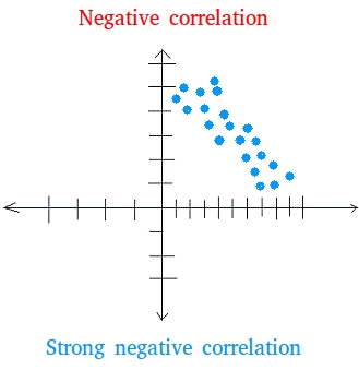
Not only the points have a tendency to go down, they are also very close to one another. This type of correlation, as seen in the graph above, is called strong negative correlation as well.
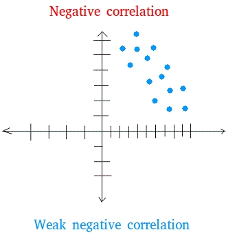
On the other hand, when the points have a tendency to go down yet they are scattered far apart from another, the graph has a weak negative correlation. The graph below has a weak negative correlation.
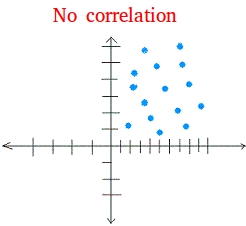
When x and y are not related, we say that the two sets of data have no correlation.
